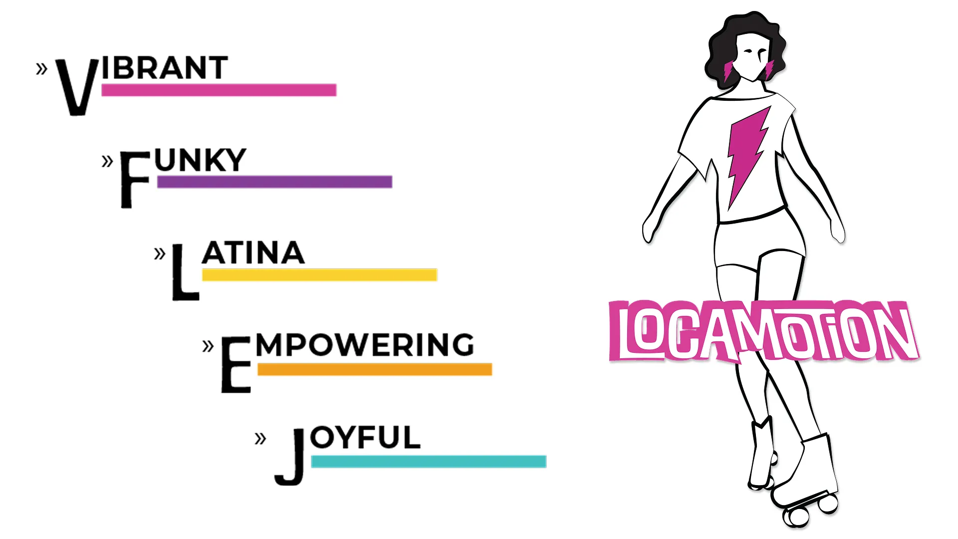
Locamotion is a roller-skating school in Vancouver. Her founder, Mariana [AKA "Loca"] is all about inclusivity, empowerment, and joy.
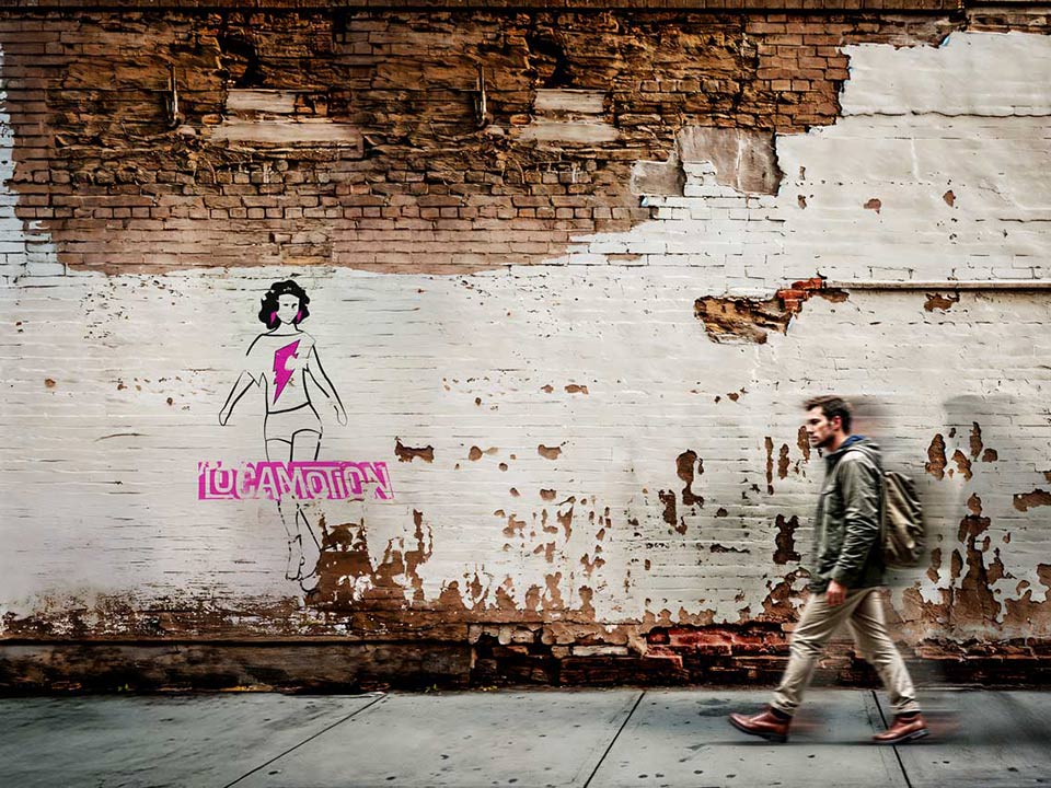
With a strong foundation in values like respect and fun, Locamotion is a welcoming hub for everyone, whether you’re a part of the Latin community or just drawn to the incredible atmosphere she creates. And just like the thunderbolt tattoo on her arm, Locamotion is a flash of energy, sparking confidence and fun in every student she teaches.
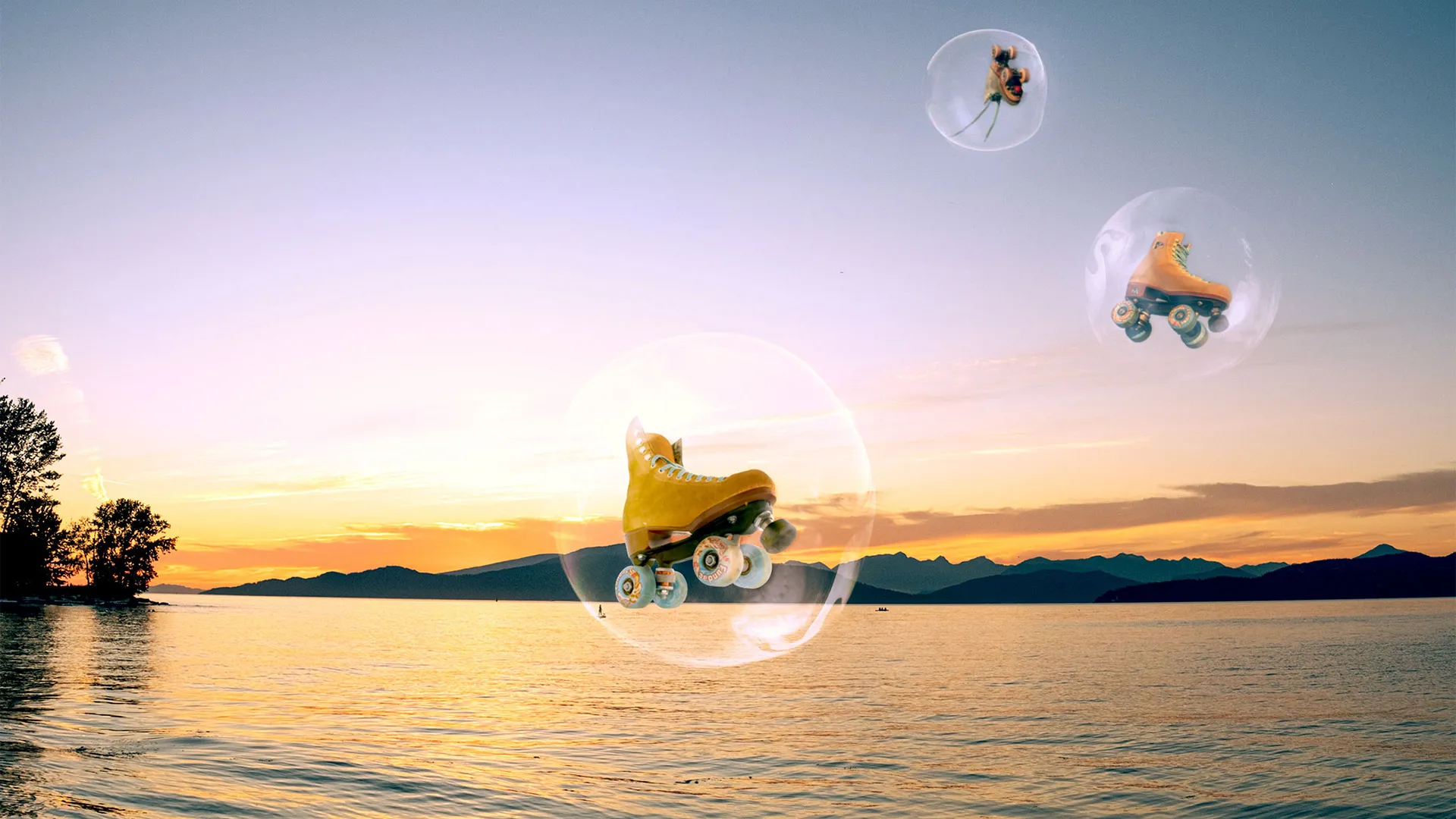
From her bold Peruvian-inspired branding to the irresistible beats of her playlists, Locamotion is more than a roller-skating class it’s an experience that blends culture, music, and movement in a way that’s truly one-of-a-kind.
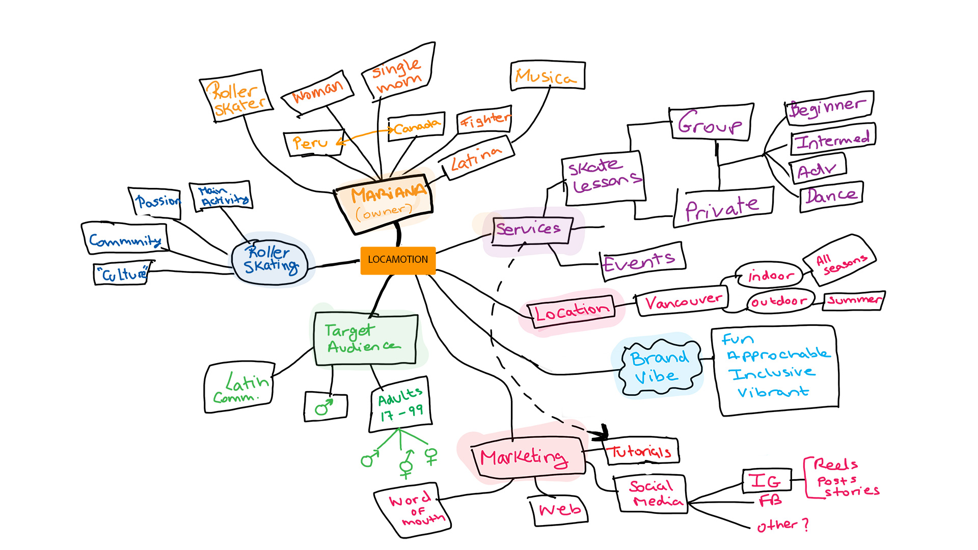
From learning about the client, to sketching and developing a vector logo
Dumping ideas. Learning about Mariana and her brand.
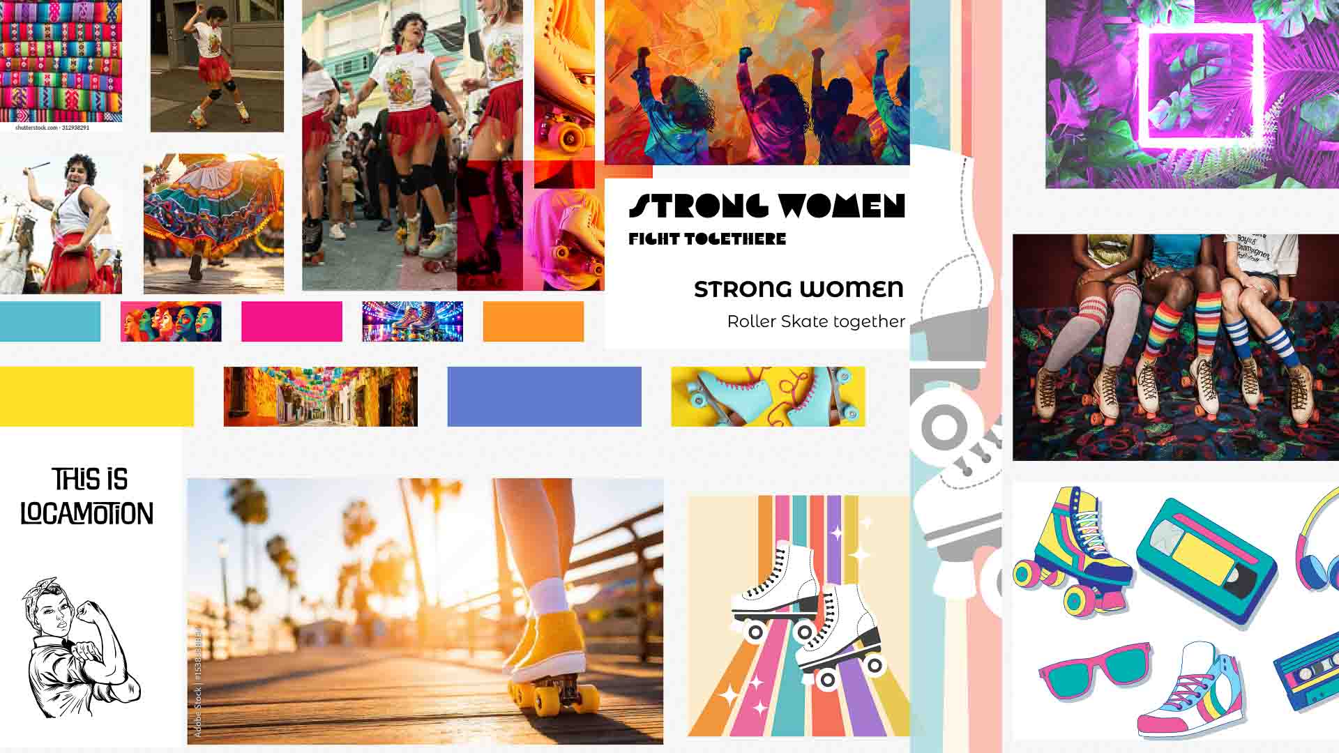
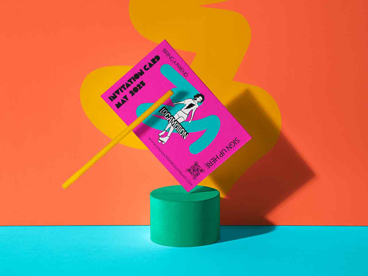
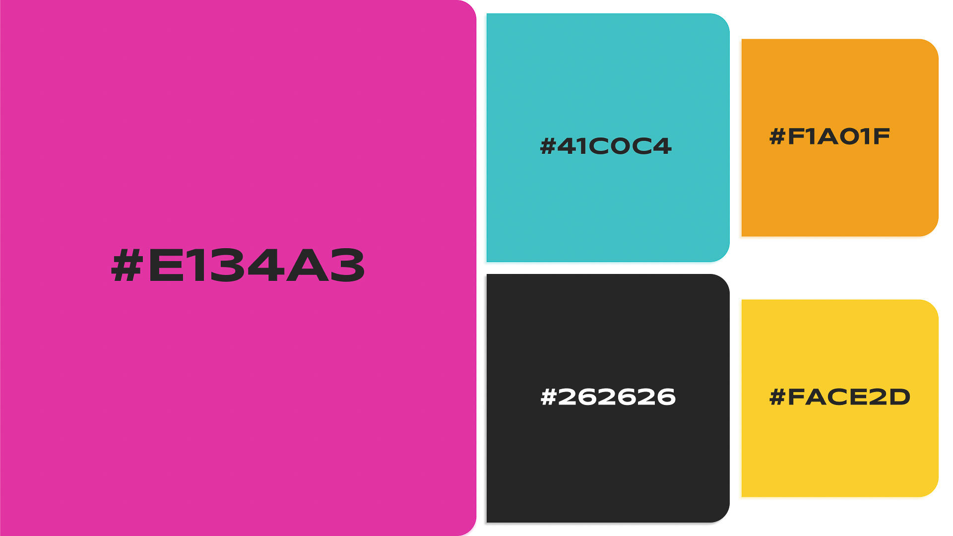
Inspired from Peruvian and Andine indigenous colors. Intense, vibrand and powerful, just like the original cultures of South America, just like Locamotion.
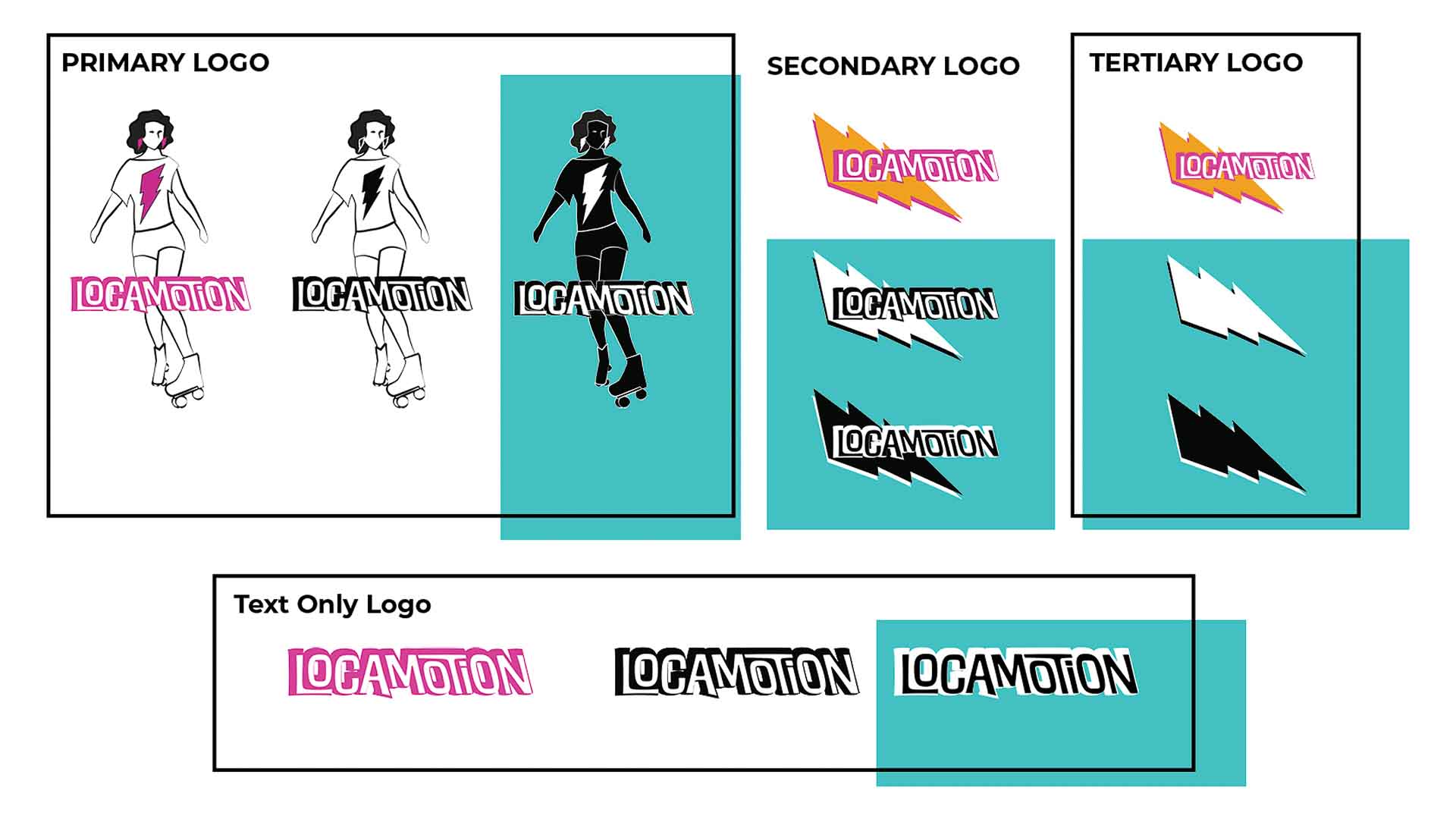
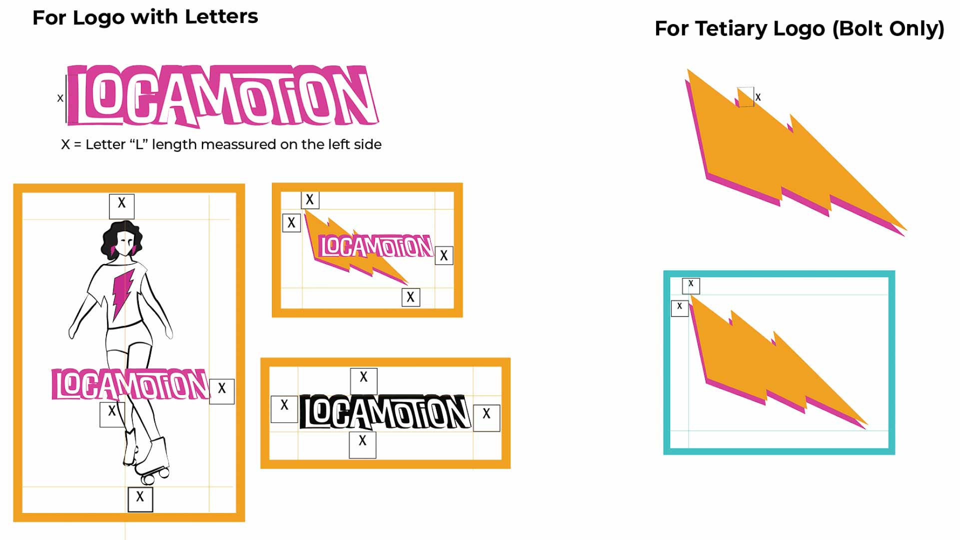
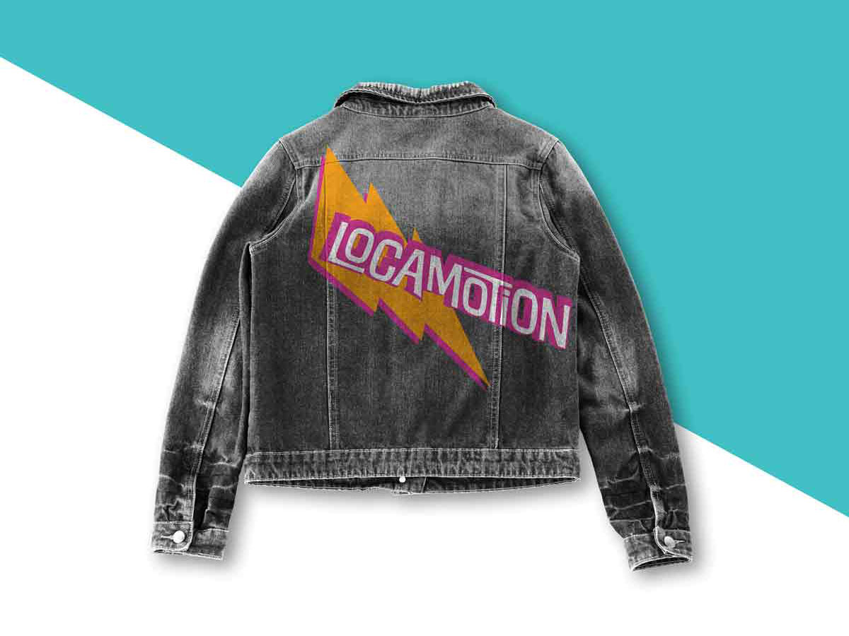
After the creative brainstorming and brand research, this is how the final brand looks like